Google+ House Revivals

Sunday, April 11, 2010

Hand Made @ &Made


I really, really, really like hand made stuff.  And stuff made from re-used stuff.  And creatively made stuff.  And useful stuff.  And funky, fun stuff.  And the folks at &Made make all that stuff. So, of course, I like &Made's stuff.   Most of &Made's hand made stuff is bespoke stuff, but that's okay.  I can be content to look  at the pictures and be inspired.

This table is a fun take on the rediscovery of wood slab furniture.  Typically, you would see a piece like this juxtaposed against sleek metal legs-- rustic and modern (think West Elm). But &Made isn't typical. Here, the juxtaposition is between rustic and traditional.  The color pop keeps the eye excited, adding interest and humor to the piece.

Here's another take on the traditional versus rustic pairing.  Maybe I love this because my eccentric and frugal great-grandfather would have "repaired" a broken stool seat with something like this.  Of course, for him it was all about function and frugality, and had nothing to do with artistic expression.  And yet, his "repaired" pieces had an unpretentious beauty.

Of course, you want to pair your graceful Queen Anne legs with a rustic slab of wood!  I get this marriage.  Maybe I get it because I'm married?  I can appreciate that it's in our differences that we all find our complement

Once again, the juxtaposition here is unexpected -- not at all what we would see in a mass mailed catalog!  Love the high tech vs. woodsy statement.

Okay, even their "sleek metal vs. rustic pairing" isn't what you'd expect.  They still managed to make it look a little hobbled together and unplanned. So fun!

These stools may just be my favorites!  They have a sort of clandestine sneaking away from "high tea in the garden" to meet your hot lumberjack feel.  What's not to love about that?

If you'd like to see more of the unique hand made creations at &Made, click here.  Enjoy!

Thursday, April 8, 2010

L is for Lighting Design

Have you ever tried to work at your kitchen sink, and been frustrated because the light source was behind you, and you were working in your own shadow?  Or lived in a house where a light source was placed too close to the thermostat, causing the heater to shut off before the space was actually warmed?

Have you ever gone out to eat, and had the pendant light over the table create such a bad glare that you shaded your eyes throughout dinner?  Or lived with poorly placed track lighting?  
Or not enough lighting? Or had so much light that you could 
perform brain surgery -- if you didn't pass out from heat stroke, first?  Oh, the sins of bad lighting design!

The lighting in this kitchen is pretty typical of what most of us grew up with.  Now days, we usually get a can light over the sink, and a lamp under the range hood.
Okay, let's try to avert our gaze from this poor kitchen's lack
of landing spaces, and focus on the One. Ceiling. Fixture.  No 
matter where you work in this kitchen, you will be working 
in your own shadow.  Who needs to see, anyway, when you're
dealing with sharp knives and boiling liquids? photo cbbain

Fortunately, standard kitchen lighting has improved somewhat in the last half-century (though not as much as you'd hope)!  Here is a case of good intentions gone awry.
 The owner of this home got some bad advice when it came
to updating their kitchen lighting.  This is a case of too much
light, in all the wrong places.  The fixture over the sink should
have been located slightly forward -- to light the work area 
instead of the worker.  The fixtures over the counter, however, 
are placed a little too close to the cabinets --this is going 
to cause "hot spots" and glare, as the light reflects off the 
white cabinets. Fewer and more carefully placed cans and 
layered lighting would have made this kitchen a much more 
comfortable space to work in. photo estately website


Alright, I know it seems like I'm picking on kitchens in this post!
  But, I could not resist showing this poorly placed track lighting.
  Sadly, we have the very same fixture over the dining area in our 
temporary-while-we house-hunt-or-maybe-get-transferred-again
-corporate-apartment!  I'm not picking on track lighting -- when 
used properly, it can be an excellent solution-- but in this application,
it will only serve to light the back of the head of the person working
in the kitchen  or shine a glaring light in their eyes.   Rule #1 
of good lighting:  know which surface you want to light, and
light it.  One of the lamps in the above picture seems to be 
lighting nothing but air....  photo cbbain

Most of us live in builder grade homes, with builder grade lighting.  Nothing special. Just the bare basics.  Most builder homes have lighting in hallways, bathrooms, laundry rooms, and kitchens, and no lighting at all in living rooms and bedrooms.
This living room is pretty typical of homes built in the last half-
century (ironically, earlier homes often had ceiling fixtures and/
or sconces in their public spaces). photo cbbain 

So, someone moves into their new home and quickly realizes they want more hardwired lighting.  They are tired of living in the dark.  And they call a contractor and have him install several recessed cans in every room, and some trendy looking track lighting from the local home improvement store.  They've suddenly spent a ton of money, and now they have too much light in some places, and lots of glare, and they've still haven't solved the problem!
 Wow!  There are a lot of recessed cans in this ceiling!  This is 
the gift that keeps on giving -- after living with migraines from the
glare, you'll get another headache when you get your electricity
bill!  Not only will the lamps use a lot of energy, but they will
increase the cooling load on your AC.  photo DecorPad via ShelterPop

Lighting a space properly isn't easy. That's why so many people get it wrong. Most people who update their lighting are just trying to fix inadequate lighting they inherited when they bought the house.  Unfortunately, they often rely on their contractor to help them design the new lighting-- and most contractors don't have any lighting design training (actually, many architectural programs don't require lighting design classes, either)!   So, they end up with a grid of can lighting, or trendy looking track lighting that shines in people's eyes or that lights nothing but air, and lights that overheat the space, and so on.

Although fixture finishes and styles have
changed in the last couple of decades, the
lighting "design" of most new homes today 
has remained the same-- inadequate.  
When the owner of this house sees himself
in the mirror in the morning, he's going
to look like he had a bad night. photo cbbain

Your builder is probably going to install the minimum number of fixtures he can get away with installing according to local building codes.  He's likely to give you one multi-lamp fixture over your bathroom mirror, because it's cheaper to install than sconces that flank the mirror.  He's not concerned that your face is not evenly lit, and the first image you have of yourself in the morning is of unnaturally shadowed eye sockets.  He's concerned about the bottom line.  It's not personal -- your builder is a businessman, not a lighting designer.

Here is an example of a remodel that was almost exceptional, except for awkwardly placed lighting.  If you notice the picture, most of the light is hitting the wall next to the sconce.  If the sconce had been properly placed, it would have lit the face of the person standing at the vanity -- not the wall next to the ceiling.
This bathroom breaks my heart.  The fixtures and 
finishes are stunning.  Just beautiful.  But the vanity
would have been more functional, and the lighting
more flattering, if the sconces had been placed 
at"face level".  It kills me to see someone put 
significant resources into a project like this, and 
get something as essential as good lighting so 

One trick your interior designer or lighting designer may use is "coloring", using yellow pencil, exactly how a light fixture will light a surface.  This can be done on elevations, axonometric drawings, or in perspective drawings.

This can also be done using 2-D and 3-D software.  For more complicated lighting problems, and light commercial projects, your interior designer will probably do a little algebra, to determine exactly how much light is needed in a space, and which fixtures and lamps to use, and where best to put them.  For seriously complicated lighting design (think shopping malls, hospitals, and schools), there are computer programs that will do the algebra for you!
Once again, I hope I haven't confused you -- or worse, bored you.  There is just so much to know about good lighting--types of lamps, colors of light, intensity of light, types of lighting (ambient, accent, etc.), dimming characteristics, color rendering, heat, cooling loads, glare, safety, building codes -- the list goes on.  In the design industry, good lighting is considered "jewelry" for the home!

This article has only scratched the surface of what is involved in creating beautiful, exceptional, functional, and safe lighting plans.  If you are considering a remodel, building a new home, or planning on doing some updating, you might consider having an interior designer or qualified lighting designer work with you to find the best solutions for your lifestyle.

This post is being linked to Jenny Matlock's Alphabe-Thursday.

Saturday, April 3, 2010

Oh, Junktion, I Love Your Funktion!


Have you ever run across something that 
just stops you in your tracks?  Well, that's what happened to me the other day when I stumbled upon a Tel Aviv outfit called Junktion.  This creative group of people takes "thinking 
outside the box" to the next level. 

You probably know from reading past posts (or reading the blog title) that I am all about reviving things.  Reinventing. Repurposing. Reusing. Rethinking.  The folks at Junktion definitely have this philosophy figured out!

Aren't these the coolest baskets EVER?


Or how about some scoops?

How about this for a new spin on bicycle seats?


I would travel far and wide to find luggage furniture like this!  Or this...


If your alter ego is getting on your nerves, you can always move over...

This fun lamp would be as at home in a city loft as in a country house.

This is such a fun take on drawers!  (some of you know I have a "thing" for repurposing drawers....)

Do link over to the Junktion website, and see the rest of the products this amazing group has created!

Thursday, April 1, 2010

K is for Kitchen Design

A popular topic in on-line forums and on blogs is kitchen design.  All the amazing new cooking shows have contributed to the interest, as have many of the real estate and decorating programs on cable TV.  And, I have to tell you, there is a lot of great stuff out there!

photo courtesy BHG website

As I surf around, I am continually impressed by the creative and beautiful solutions people find for their homes.  Sometimes, however, I see something that worries me because it is unsafe.  Sometimes I see something that is not as functional as it could have been, and sometimes I see something that could easily have been more beautiful.   

Often these are kitchens that have been designed by builders, but sometimes they are designed by the homeowner.  In either case, a lot of issues might have been avoided if a design professional, such as a qualified interior designer or an architect, or an experienced kitchen designer had been involved early on in the process.


As a designer, it is heartbreaking to see someone spend huge amounts of time, energy, or money on something, and end up with a product that isn't fabulous.


Good kitchen design is hard.  It involves a million little details, like making sure you have appropriate landing areas. And being familiar with local building codes...

 
image from 

... and being aware of safety issues that local codes may not have addressed. For instance, although a few jurisdictions still allow a window to be placed over a range, it's almost always a bad idea.  First, ask yourself if the framing is combustible. Then, if the window was at one time operable, would it be a simple matter of removing a screw to get the window open?  Drafts from an open window can create a huge fire hazard over a range. Would you, or a future tenant, be tempted to hang a window treatment?  There are safe ways to install a window over a range, but it needs to be a permanently inoperable window, with non-combustible framing, and it must not cry out for curtains.

Good kitchen design involves understanding how the human body works, and how much space it needs to perform certain tasks.    And knowing how much room you need for your feet -- or your knees.

Anthropometric (body) measurements of most use to designers of interior spaces (Panero, J. and Zelnik, M., 1979, p. 30). 

Good design involves understanding lighting design concepts.  I once had a client whose contractor convinced her she did not need to pay for a lighting design -- he would design the lighting for "free".  Rather than spend a couple hundred dollars for good lighting design, this client ended up with SEVENTEEN recessed six-inch cans in her kitchen!  The money she spent on unnecessary cans and installation would have more than covered my design cost.  I feel so bad for the client.  She has a beautiful, expensive kitchen.  It took several months for her contractor to complete the project.  And she has SEVENTEEN cans!  And they are HOT.  And she's at an age where she gets hot flashes!

A good kitchen designer addresses efficiency. And flow. And storage.  And knows how house systems work. And figures out which direction the joists run -- and how far you can run your exhaust duct (or where you can put your plumbing or HVAC).

 photo courtesy http://rkrc.blogspot.com/

They will have an understanding of special needs, such as Kosher meal preparation, designing for aging in place, or multiple cooks, or large families, or families with lots of pets, or for the mobility or seeing impaired. Kitchen design involves reading so many appliance specs and installation instructions, you see them in your sleep!
And we cannot forget cabinet layout -- have you ever tried to open a drawer, and discovered the adjacent range was in the way?  Or been trapped in front of your corner sink when the dishwasher is open? 
source unknown.  Note the placement of the prep sink in relation to the stove and
dishwasher.  If either of these were opened, the person at the prep sink would be
trapped.  That could be especially bad if the combustible window frame over the
range ignited!  Also, anyone standing at the prep sink, would be in the way of 
people working at the range.  And forget about having the dishwasher and the
oven door open at the same time.  This kitchen makes me sad, because the
owners obviously spent a lot of time and money here.  By spending a just a few
hundred dollars more, they could have gotten a great design to go with their
beautiful appliances and finishes.


Have you ever tried to take something hot out of a microwave that was mounted too high?  I have to say, having boiling liquid sloshed in your face can ruin your day.
  Thank God Susan doesn't cook!  This set kitchen for Desperate
Housewives has a ridiculously high microwave!  Sadly, so do
many real life kitchens.  Photo via Hooked on Houses.

Your designer can help you address all of these types of issues, AND make your kitchen beautiful.  Sometimes I think we get so caught up in making things "look pretty", that we forget to make things safe and functional first. I am here to tell you that you can have it all -- by investing a little more on the design end of your project (the front end), your finished product can add safety and function to your home, without sacrificing beauty.

This post is being linked to Jenny Matlock's Alphabe-Thursday.


Thursday, March 25, 2010

J is for Japanning

Japanning typically refers to a technique of lacquering and polishing a piece of furniture or metal ware, wood, or paper mache.
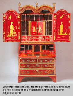
Most popular in the eighteenth and 
nineteenth centuries, Japanned work was created as a way to "knock off" heavily lacquered and decorated pieces being imported from the East -- primarily China, Japan, and India. 

For an informative article on the history of Japan work written by Louise Devenish, click here
photo courtesy 1stdibs website
This secretary is an example of a piece you will see in her article.

A term you will often see associated with 
Japanned goods is chinoiserie.  "Chinoiserie" comes from the French, and refers to European or Western items that have been decorated with fanciful interpretations of Chinese scenes.  

Examples of chinoiserie can be found in painted wall coverings, textiles, applied and structural decorations, and painted accessories and furniture.  
 
photo courtesy Made in the Black Country website
This tilt top table, depicting a stylized "Chinese" scene is an excellent example of Japanned chinoiserie.


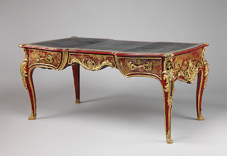
The red Japanned and gilded chinoiserie table shown here is a stunning piece.
 You can learn more about this piece, made for Louis IV, at the Metropolitan Museum of Art website.

The detail on this drawer front is just incredible.


Although different interpretations of Japanning techniques were developed in other countries, parts of England became especially well known for their Japanned products.
photo courtesy Wolverton Art and Museums website
Of course, not all Japanned articles are furniture, nor was it made only for kings.  The crumb tray and brush shown here, is an example of a utilitarian piece that would have been produced for the rising middle class. Even in the photograph, the visual depth achieved by layering the decorative elements and lacquers is evident.


This paper mache box is another example of a small utilitarian piece.
Photo courtesy Gasoline Alley Antiques
 The decoration depicts a Father Christmas, with Eastern inspired designs on the borders of the box.


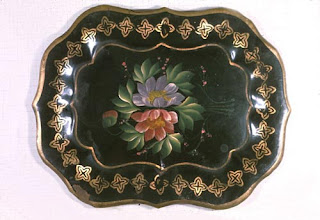
The tin tray shown here is an example of Japanning on tin ware, often referred to as tole (not all tole is Japanned, however).
photo courtesy Wolverton Art and Museums website
In this case, the decoration is achieved through one-stroke folk painting techniques rather than by depicting a chinoiserie motif.  The border is painted in a simple, Gothic inspired quatrefoil design.


This teapot stand is another example of a utilitarian piece produced for the middle class.
photo courtesy Made in the Black Country website
An interesting article about the social implications of items as simple as this trivet can be found here, on the Made in the Black Country website.

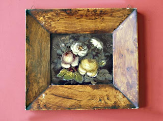
My favorite piece, however, is this unapologetically non-utilitarian wall plaque.
photo courtesy Wolverton Art and Museums website
First of all, it is not in the least bit pretentious.  It feels like a nice "homey" bit of folk art.  This is definitely "art for the masses" (perhaps we'll see some knock-offs of this piece in a Pottery Barn catalog someday). The faux bois detailing is absolutely charming.  This piece represented "art for art's sake", but pieces like it were accessible to anyone.

Art for art's sake has been important in all levels of society -- whether it be in a king's palace, in the parlor of a member of the rising middle class, or in the living room of a peasant worker.  I think that is why I am drawn to Japanned items -- not only did the inspiration for the technique span continents, but access to Japanned items spanned socioeconomic levels.

This post is being linked to Alphabe-Thursday, at Jenny Matlock's blog, and to Colorado Lady's Vintage Thingie Thursday.