Google+ House Revivals: February 2011

Friday, February 25, 2011

One Family's Design Story, Part One

**be sure and check out our new Facebook page!  We've even created a new Facebook album with links to many of House Revivals' craft projects!  Come check us out -- we love to be "liked"  :)  ** 

Sometimes you just fall in love with your clients.  This is what happened to me when I was approached by a lovely southern couple who needed some help with their fixer-upper house.  The husband was an engineer, and the wife stayed home with their four children.  Sounds perfect, right?  Well, like anyone, their lives were complicated.  They had a large extended family that visited often, a mother-in-law they were supporting, and all the lessons and carpooling that goes along with having children. They had been transplanted to our community a couple of years prior. The husband was a gifted DIYer who had  survived several rounds of lay-offs at his company, in addition to surviving a couple of heart attacks.  He was in his mid-forties.  Throw in a couple of basement floods and a tight budget and you get the picture....  Something had to change.


They had come to the realization that their time, energy, and resources were finite.  They still felt they could do much of their own work, or at least manage their own projects, but felt overwhelmed about coming up with an over all plan.  They were tired of buying things and renovating things that didn't quite work out, so they hired me to help them formulate that plan.  As I got to know this sweet family better, my heart just really went out to them, and I felt so honored that they chose me to help them find some design solutions.


We started in the entryway by addressing the flow of the house.  They had an entry closet behind the front door with steel bi-fold doors that were loud, never stayed closed, but stuck when you tried to use them.  The bi-fold doors and the front door were constantly colliding.  It was easier to dump coats and backpacks on the floor than to use the closet, so that's what they often did...


I suggested removing the bi-fold doors and adding a custom built-in, creating a storage space that was easy to use.  There was still room inside the bench for shoes and boots, while seasonal items could be stored in baskets above.  It made keeping the entry way tidy much easier.  I also noticed the white painted hand-rail for the stairs was dirty, and suggested that it be stained in a forgiving dark walnut color.  The space already had dated real wood wainscoting, which the clients had planned to remove.  I talked them into changing the trim work and painting the paneling.


You had to walk through the laundry room to get into the house from the garage and workshop, but the garage door and dryer door (and the baskets of laundry) would interfere with each other.  We talked about moving the garage access door to an adjacent wall so that the family could enter the house in the corner of the family room.  I then recommended creating a bump-out off the laundry room  (where the door had been) for additional laundry room storage. 

The laundry room was right off the entry hall, and from it you could access a sort of powder room, if you will.  Basically, it was a tiny room with a toilet and a utility sink.  Moving doors and plumbing for this space was out of the question, or I would have suggested accessing the powder room directly from the hall, and putting a door on the laundry room.  Also, the couple really needed another shower for their family of six.


After doing some careful measuring, we determined a way to add a shower to the "powder room", by taking over an adjacent closet located in the garage. I also talked them into replacing the utility sink with a lavatory sink.


We discussed stacking the washer and dryer to free up some space (I only suggest this when space is at an absolute premium).  By doing so, the clients would have room where the washer had been to add a small pantry, as well as additional laundry room storage. 


It bears repeating that the arrangement of doors into this space was not my first recommendation to these clients.  I really would have preferred putting a door on the laundry room, and moving the powder room door so that it opened off the entry hall.  Eventually, I discovered that the husband had already built a new custom door and trim work for the powder room to replace the original oddly-sized door, and his sweet wife did not want to burden him with the task of redoing it.


By moving the garage access door to the corner of the family room, pressure was taken off the laundry space. We were also able to make use of previously wasted space in that corner of the room to create another coat and shoe storage area -- with four kids, you really need this kind of storage at every entrance!


You can see, on the right in the above image, the suggestion of cabinet doors. The husband had already hand built and installed beautiful new cabinets in the kitchen before they hired me.  Although the kitchen renovation was lovely, the clients had unfortunately lost valuable storage space in the process, and I noticed lots of items that should have been in a pantry (like loaves of bread and bags of chips) were now kept on the counter -- and they had lost counter space in their kitchen renovation, as well, so there was very little work surface available.  My job was to gently suggest ways to recapture kitchen storage, while still acknowledging the beautiful job they had done on their kitchen renovation.  This is why I suggested stacking the washer and dryer to create space for a small pantry.  The wife was delighted at the prospect, and the husband, who was an expert carpenter, was intrigued by the opportunity to create more custom cabinetry!


This is the first installment of this lovely family's design story.  I would love to have your feed back.  Do you want to know more?  Do want to read about other projects and design solutions?  I hope the lack of "mood boards" hasn't disappointed -- there's nothing wrong with mood boards and inspiration boards and materials boards, but it is only a wee tiny bit of the interior design process.  The lion's share of the process is interviewing, researching, schematics, space planning, and so on.  Yes, we always have our clients' finish and style preferences in the back of our minds while we work, and I try to show finish suggestions when creating models and drawings, and yes, finishes are tremendously important, but once you have a great design, the decorating usually falls into place.

I would love to have your feedback -- are you interested in this type of interior design article where we explain what we did and why?


For another home reno concept, click here to see a "before and after" from our beach house project!


504 Main

Tuesday, February 22, 2011

Little Notebook Make Over

Recently, I was looking for a little notebook to organize some materials samples and dimensions for the beach house project.  Honestly, when I'm carrying client materials around they are often stapled inside a file folder along with project notes, but for my own little project, I wanted something a bit more special, and to be able to slip it inside a handbag.


This little file folder notebook was a thrift store find.  I liked the size, and didn't mind the pink elastic and the pink file organizer inside, but the juvenile pattern wasn't doing it for me.  Plus, it had price tag adhesive stuck to the cover and was kind of dinged up.


Recently, I embellished some clip boards in various sizes for taking notes on job sites, and for viewing and presenting materials, so I thought it would be fun to make over the little notebook to coordinate with the clipboards.  I haven't actually blogged about the clipboards, yet, so I will only share that little glimpse for now.


This project turned out to be pretty quick and painless, unless you count the almost two episodes of Outer Limits it took to finish....  You can find notebooks similar to this at discount stores and stationers and they often show up at thrift stores.  Start by gently pulling the notebook and the accordion  file from the cover.


I love that these notebooks even have a place for a pen or pencil!


Next, I just covered the notebook cover with vintage book paper, added a little upholstery webbing, and glued the notebook and accordion folder back into place.  So easy!


You can see it's the perfect way to carry small materials samples and sketches, and to keep your notes about your project handy. 


Play around with adding embellishments, if you'd like.


Although I really like how this more dimensional embellishment looks, I ended up going with a little vintage crocheted flower and a flat pink button, so it would tuck more compactly into a purse.  The flower was applied using Mod Podge.


 Which do you prefer?


Plain and more compact?  Or a little fancier and more dimensional?   Wouldn't a vintage brooch be amazing on one of these?

Monday, February 21, 2011

The Beach House is Moving Up!

We went out to the coast to see the beach house progress this weekend.  It was incredible walking around under the house and seeing the amount of work that has gone into getting it raised!   It has now gone up about three feet, with another six feet to go.


The contractors had to punch holes in the existing stem wall to get their steel I-beams under the structure.  While we were there this weekend, workers were already building forms to patch the holes.  The photo here shows where new reinforcing bar has been placed prior to pouring the new concrete.


For the wing of the house that used to be a garage, the contractors ran their gear right through the middle of the space, since they couldn't get underneath this part of the house, as it was sitting on concrete -- the old garage floor, which will be a garage floor again soon!   If this space looks familiar, it is because I shared about it here, discussing before and after concepts.


In the hallway, you can see where the floor transitioned from the old garage and workshop concrete slab to joist framing.  There is simply no floor where the house was lifted off the slab.  New floor joists and a giant steel I-beam will be added to this wing.


And speaking of steel beams, here she is!  Isn't she a beauty?  And yes, this is my inner geek speaking.  You will find most interior designers have an inner geek.  We don't usually fit into "right-brained' or "left-brained" categories, as we have to have a strong working knowledge of building and mechanical systems, in addition to having a strong appreciation for beauty and art.  And speaking of beauty, this little number is going to be the center support for the entire east wing of the structure. 


This is one of many jacks being used to raise the building.  They are connected to one control panel, and the house goes up very evenly.  As the house goes up, cribs are stacked under these beams to support it.


The ocean facing deck is going up with the house, as its roof is integral to the house.  All the other decks were removed prior to lifting.  See the stack of cribbing that supports an I-beam running under the house?  That I-beam supports several other I-beams running the other direction.  There is a lot of steel under the house right now!


We have a beautiful brick chimney and fireplace that we wanted to preserve, so they are lifting that, too.


This is the view from the courtyard.


You might also notice that we have a new neighbor.  We knew it would happen, and had studied their building plans before buying this property to make sure they weren't going to build something strange, as well as to study how it would affect our day lighting and views.  We really don't mind having neighbors this close on one side, because to the west the only thing between us and God is ocean and sky. 


Above, is an exterior view of the garage wing of the house.  When it goes up another six feet, a new garage will be built underneath it.  Below, is an interior view of the back part of the garage wing.  There are two doorways shown here.  One (on the right) led to steps to a grade level exterior door.  The door on the left led to the world's grodiest bathroom.


Those two spaces will be combined to create a den/ fourth bedroom.


Above is another view of a jack, an I-beam, and a stack of cribbing.


And this is all that stuff we talked about earlier that lies between us and God.

They are supposed to resume lifting tomorrow, so hopefully by the end of the week we will have more pictures to bore you with!


Wednesday, February 16, 2011

Beach House Courtyard Concepts and a Curveball

Yesterday I spent part of the morning working on some courtyard concepts for the beach house remodel.  Partly because I am SOOOO ready for spring, and partly because the concept we decide to go with will impact the entry stairs which will impact the "man door" placement for the new garage.  So, after about an hour of CAD, I opened up SketchUp to play with some courtyard furniture placement ideas in 3-D, including an outdoor kitchen, and a fireplace.

Did you visit the Coastal Living Ultimate Beach House in Seabrook last year?


I loved that courtyard!  The fireplace, the seating area, the dining area -- it was perfection.


Now back to reality.

This is kind of what our courtyard looks like right now (minus the rotting decks... and the house is partially jacked up right now but I will share more on that next week).  As you can see, anything would be an improvement!


When my husband got up and saw the models I'd created, he felt I'd gotten everything ALL WRONG.  I was thinking of a quiet tranquil space, out of the wind, to retreat to with a glass of wine and a magazine.


The thing is, our daughter and son-in-law have recently informed us that life is throwing us a delightful curve ball.  Soooooo, my husband took one look at the concepts and said  "where is the swing set and what about a slide?"

Just for fun, I hodge-podged together a little play yard for him.


He even had this kind of cool idea to put in a tube slide from one of the decks!  I haven't put a model of that together, yet, but why not?  If I have time to whip one up, I'll post it on the House Revivals facebook page.

Of course, now when I look at the original idea for the courtyard, it seems a little dull and boring... as if something is missing....


Oh, there it is!


A sweet little tricycle just waiting to trip up an unsuspecting grandpa as he steps out the door with a platter of steaks.

Life is so good!


Edit:  We have some new progress on the beach house, that you can see here!

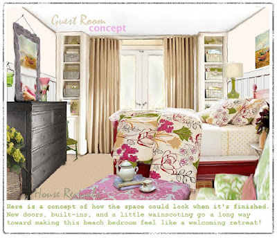
To see a concept for one of the guest rooms, click here, and to see more of the beach house and some concepts for the renovation, click here.

Be sure to hit "follow", in my side bar so you won't miss the upcoming posts on the house raising, and lots of cool pictures of our castle in the air.  Also, if you are on facebook, come check out our new page and click "like" for lots of mini-updates and links!  And for all my crafty peeps, I've got a few tricks up my sleeve, and some projects on my work desk :)


The post is being linked to the following lovely sites:


The Girl Creative

Monday, February 14, 2011

Mod Podge Rocks!


Amy, over at Mod Podge Rocks, hearts my British Invasion Love sign!  She hearts it so much that she's featuring it as the project of the week.  


If you heart Mod Podge, and you haven't seen Amy's blog, you'll definitely want to pop over for a look around.

I hope you are all having a sweet Valentine's Day!