Google+ House Revivals: January 2010

Monday, January 25, 2010

Big House Before and After Concept

The Problem:
There is a big house in my neighborhood that sits on the market for a lonnnnnngggg time every time an owner tries to sell it.  This house has been "remuddled" too many times over the years and has taken on the look of a lady who has has too much "work done".  You know what I'm talking about-- the tightly stretched skin, the too puffy lips, the absence of character lines.  This poor lady has had her face "lifted" to the point where she just doesn't have much character left (and we won't even talk about her most recent southwestern style remodel on the interior)!
Before a house can sell, you've got to get the buyer in the front door, and unfortunately, many potential buyers won't even get out of their car if the house doesn't look good from the curb.  So, just for fun, I gave her a quick "makeover!"  Her problem areas included the huge expanses of bright white stucco, unrelated roof-lines, slit-like windows, the blank stare that often results from enclosing a front porch, and an uncertain pedigree.  Oddly, although the front porch has craftsman-like bones, the body of the house appears to be four-square in style. Obviously, one of those "styles" is not original to the house.

Most definitely the hip dormer on the front of the house is not original, either.  It feels a little awkward because, honestly it isn't something people are accustomed to seeing in American Vernacular houses.  It almost wants to be a clerestory, but kind of wants to be a hip dormer-- basically, it's having an identity crisis.

The Solution:
It is not feasible to tear off the many additions this house has suffered over the last hundred years, so, working with her present bones, here is what I came up with.

First, let's address the porch.  The porch should be a feature.  So, let's emphasize its craftsman styling by calling attention to the massive columns, and by breaking up the expanse of stucco in the gable with "half-timbers."


Next, we should contrast the stucco portions of the facade with the window trim color to address the old house's "vacant stare".  Simply by contrasting the color value on the window trim and the stucco, we have turned the beautifully paned windows into a feature, and emphasized the porch's pedigree.


The final change to make to the porch would be to give the foundation some visual weight by painting it a slightly darker hue than the gable.  The most important part of this house's  face lift is the porch, because that is what will grab the eye, and distract the buyer from some of the house's odd architecture.


To address the house's slit-like windows, I'm recommending realistic looking shutters.  That ever-problematic expanse of white stucco can be broken up with very understated "half-timber" trim, and a subtle change in hue below the trim piece.


The "not a typical dormer, but not a clerestory, either" should be down-played to keep the interest on the porch.  We don't really want the body of the house to compete with the porch as focal point.  Rather, we want the body of the house to play a "supporting role".  Basically, just a  few changes can go a long way toward bringing grace and character back to this house's facade.

photo courtesy H. Brandt
I'm linking this post to Met Monday at Between Naps on the Porch, and to Alphabe-Thursday at Jenny Matlock's blog.

Thursday, January 21, 2010

Grade AA Crafting

Here is a glimpse of a Grade AA ornament idea that bounced around in my brain every morning at breakfast time for nearly twenty years -- that's a lot of brain bouncing!


Today I will share a little before and after, and save the tutorial for a later post.

For years, every time I opened up an eighteen count carton of eggs, the inside top of the carton would make me happy.  Of course, the beautiful texture of the cardboard  was part of the reason, but there was something else....

I would say to people "that looks just like four little old-fashioned cars"....

... and they would look at me like I was crazy.

So, one day I decided to show every one that there really were four little cars in every egg carton!

These little ornaments make great hostess gifts, teacher gifts, or baby gift tie-ons,  and can be adapted to suit any holiday.  I've even made several "just married" versions of the little car as wedding gift tie-ons!

It didn't take long to realize there were little planes hiding in the cartons, too.
And sailboats, and canoes, and even a few kayaks, but we'll save those for another post!

I'm linking this post to Strut Your Stuff Thursday at Somewhat Simple.  Click here to see lots of great ideas and projects!
It is also linked to Alphabe-Thursday at Jenny Matlock's blog, and Thrifty Decor Chick's Before and After Party.
I'm joining Kara's Look What I Made party and Just Something I Whipped Up, at the Girl Creative.
This post is also linked to It's So Very Thrifty, at It's So Very Cheri.

Tuesday, January 19, 2010

good design or simply decorated?

Have you ever "Googled" yourself  just to see what other people might see when they "Google" you?

Well, I did this morning and I found this article from 2009 that I had completely forgotten about!  It was for a special insert in our local paper last spring.  An intern reporter came out to our studio to ask some questions.  I gave her an interview, and then promptly forgot all about it -- until this morning.
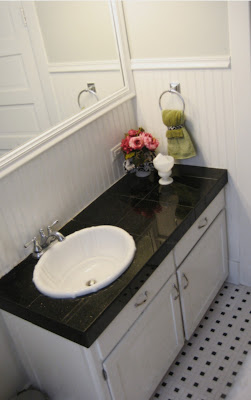
The article was about applying the "shabby chic" aesthetic to a space, and how the "shabby" look has evolved over time.

I wasn't the only designer interviewed for the article, and what struck me, after reading the article, was that the other designer and I both stressed the importance of design principles.

I think sometimes people get so caught up in the "decorating" aspect of a project that they can forget about the design of their project-- and then don't quite understand why their space doesn't feel "right".  Simply applying design principles, such as balance and rhythm and variation, to the elements we use within a space is the trick to making a space feel "right".

It's not any particular color, or finish, or style, or brand that makes a space visually "work".  You can decorate a space to within an inch of its life, and still not have a space that works.  It is simply how well the designer uses design principles when pulling the elements of a space together that determines if the space has "good design," or if it was simply "decorated."

Tuesday, January 12, 2010

Chicken Coop to Studio!

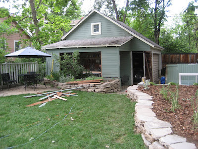
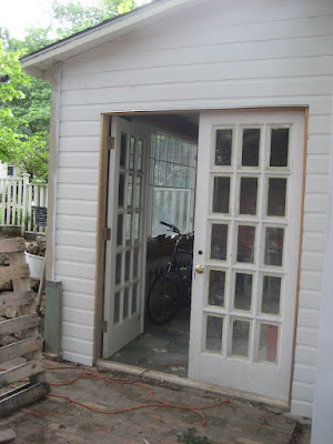
When we moved into this house, we had this long narrow "lean-to" chicken coop on the side of the garage.  The lean-to had three very low openings on the side, and a removable panel on the front and no foundation.  It was dark and cave-like.  

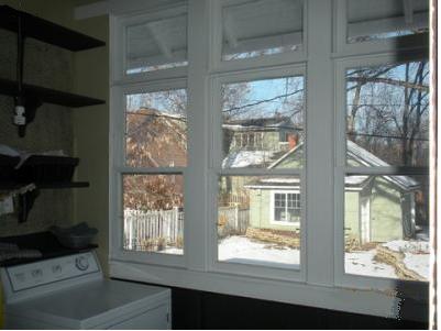
We built a foundation early on, but for years the old lean-to was still just a cave.  Then one day my husband came home from the Habitat for Humanity ReStore with a big grin, and an even bigger window!  And no idea how to install it  (I'm the construction expert in the family).

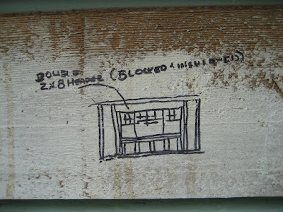
Sooooo, I drew up a construction document showing how to frame out the opening for the window.  It's very important to use the proper drafting supplies when doing these sorts of projects!


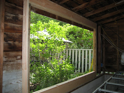
Then I "supervised" while my husband cut and framed the new opening. (see the supervisor chair just inside the lean-to?)

*it's very important to leave safety/tripping hazards such as garden hoses and extensions cords lying about whenever you do a home improvement project.  This will help to ensure the maximum number of construction-related injuries.

And I "supervised" some more while he and a couple of friends helped to install it (and, yes, I really did supervise, explaining exactly how to level the window using shims and explaining how to use shims-- God bless my patient husband)!  Once the window was level and plumb, we were in business.
And we were so inspired by how the window transformed the space, that we began our search for some french doors. 


We built a wall where the removable panel had been, bought some vintage doors from the local Resource yard, framed them out and installed them.  And we were so inspired by the french doors, that we decided the new studio was going to need a new brick patio....!


Saturday, January 9, 2010

Good Intentions, Bad Additions

Well, we're still house-hunting. We even drove by some condos and townhouses last weekend. It's a little disheartening. Real estate in our new city is much more expensive than the Boulder area was. I'm actually thinking about this house that I wrote about on my other blog, here. Not because I love it, but because maybe I can afford it. Maybe. It's definitely preferable to a condo under a noisy bridge. But, seriously???!! Why would someone think this addition was a good idea?

Wednesday, January 6, 2010

Bathroom Renovation Part Three

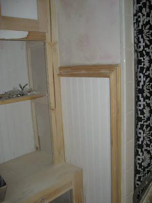
This is where I brag about my trusted handyman. Danny. He's amazing. He's the second oldest of lots of kids. His dad began teaching him cabinet making when he was just a little kid, and Danny has turned out to be a fine craftsman. Danny is the guy who did all the woodwork in this bathroom. He added beaded board, replaced baseboards that had been hacked into, and installed all of the chair rail molding. And it wasn't an easy job, because my house is crooked. So none of the angles were very straight-forward. Instead of forty-five degree cuts, we may have needed forty-seven degree cuts. And things had to be fudged in places. Because that's just how it is with hundred year old houses. But Danny did it.

I think he was a little appalled when I asked him not to replace the cabinet doors, but just trim them out. He is such a perfectionist, I think he really thought they should just be replaced with properly constructed shaker style doors. But he was a good sport, and went along with the "fake it" concept. Another thing my trusted carpenter did was replace the crown molding over the door. A nineteen fifties remodeler had hacked into it to build a ridiculously huge cupboard. Danny went to his cabinet shop and crafted a new crown molding to go over the door, and you would never know it wasn't original! And did I tell you that this amazing, hard-working, diligent craftsman just barely turned twenty-one! Impressive.


Monday, January 4, 2010

Bathroom Renovation Part Two


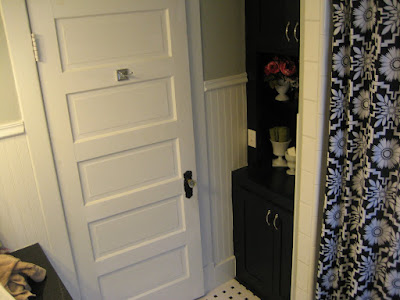
Our bathroom cupboard did not always look like this. It used to suffer from the same mid-century aesthetic that the vanity suffered from. And it was huge. It was so deep, I couldn't reach the back. And to reach the top cabinets, I had to get a step ladder or stand on a chair. Seriously! And then I would have to use a long stick to pull stuff out from the top back. How many families do you know who can store all their camping gear in the bathroom cupboard? We did! And truthfully, I would lose things in that cupboard for years.

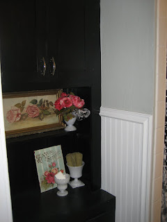
So, I had my trusted handyman deconstruct the cabinet. And then rebuild it. Using the same wood. We even reused the doors and hardware. Because, well, why waste it? The new cabinet is not nearly as deep. And it has some open display shelving. It still has some very high cabinets, but since they're only about a foot deep, you can't lose things in them for years at a time.

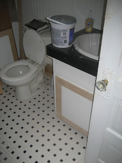
You can see from some of the before pictures where the old cupboard used to be. This bathroom was "remuddled" back in the fifties. Apparently, beautifully detailed crown moldings and door casings weren't really appreciated back then, because the carpenter who built the old cabinet hacked right into the woodwork on the bathroom door-- to build the BIGGEST cabinet possible. Well, that BIG cabinet made the bathroom feel cramped. The new cabinet is in proportion to the room, and built at human scale. And because it's a stepped back cupboard (a very appropriate style for the era of the home), more volume has been created at eye level, which makes the space feel more open.

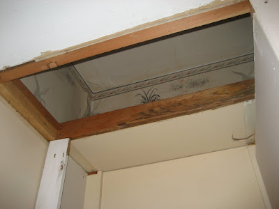
Deconstruction is a little like an archaeological dig. Old houses, in particular, have stories to tell. We can see in one of the pictures how the ceiling was dropped at the time of the fifties "remuddle". It's kind of fun to discover little treasures like that flying duck wallpaper, still intact. We enjoyed trying to figure out which of the previous owners would have installed it. And wondering why anyone would want a "hunting" motif in the bathroom! Maybe they just thought the birds were pretty. That wallpaper is still there, hidden behind the newly patched ceiling. Maybe, someday, another renovator will find it, and wonder about the stories this house has. I hope so.


Sunday, January 3, 2010

Renovating the Bathroom Part One


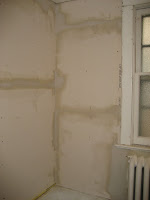
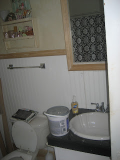
Our bathroom did not always look like this. I'm sorry I don't have any good "before" shots, but trust me, it used to have several layers of peeling and curling linoleum. And it had fifties era Formica, complete with little gold specks.

It also had very mid-century looking built-ins (I happen to like the mid-century aesthetic a lot, but this is a Queen Anne bungalow). And it had a chipped, cracked, generic oval sink--like you see for twenty-nine dollars at every home improvement outlet.


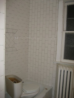
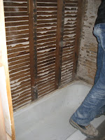
And then there was the tub surround tile. Icky. It had been installed badly by a previous owner, the tiles were crooked, and the grout was failing. In fact, a few months before we finally replaced it, we taped up a huge plastic sheet to protect the wall from water damage! Gross!

Knowing we had a major renovation ahead of us, my husband and I hit the re-use stores. Our favorites are ReSource, and any of the Habitat ReStores. We found beautiful, basket weave mosaic tile for the floor.

We trimmed out the vanity doors, so they would fit the
home's pedigree a little better, and added beaded board and a chair rail.

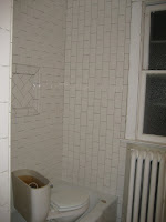
And we found subway tiles and accent tiles for the shower.

We ran the tile vertically, in a running bond pattern, 
to show off this bathroom's high ceilings.

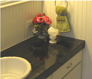
And that gorgeous black quartz tile we found for the counters? It even has some gold specks as an homage to the old Formica!
 By sourcing materials from close-outs and salvage yards, we were able to 
splurge on professional tile installation.  This was definitely worth it, as this 
bathroom turned out to be the crowning jewel of our little bungalow. 
A good tile setter is also an artist.  I love the way our artist beveled
and honed the edges of the tile, and used unsanded black caulk, instead of grout.

Did you see that amazingly deep sink? From a ReStore! The new fixtures were found on close-out, as were all the towel racks and hooks, and hardware.


We definitely did this renovation on a tight budget, but by sourcing the materials ourselves--which involved a couple months of Saturdays spent shopping at the salvage stores (these were our weekly "dates", and we loved them!) -- we were able to splurge on skilled labor. Definitely worth the cost to get a quality product!


**edit:  We ended up putting this house on the market early in 2010, and it went under contract the first week!  Our realtor really felt this bathroom renovation helped sell the house quickly.  

See Part Two of this renovation here, and see Part Three here.

This post is being linked to:
A Few of My Favorite: Room Re-Dos at The Lettered Cottage