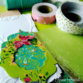
When you're pulling together an assortment of elements to create a card, it's a good idea to choose the elements based on a theme.
A favorite theme I like to use is color. Sometimes I do a "one color" card, like I shared in this post.
You might also enjoy this tutorial about making a filigree card.
A favorite theme I like to use is color. Sometimes I do a "one color" card, like I shared in this post.
Today, I will share how I choose color coordinated card elements.
I start with one main color -- in this case, the apple green background in the floral printed die cut, above. Then, I choose a second print, with the same apple green. This is the turquoise die cut, with the apple green embossed flourishes. From there, I began grabbing elements that went with that pairing, including pink washi tape, yarn, pink paper, and a scrap of embossed paper, which I distressed with an apple green stamp pad.
I also chose a gold polka dot washi tape. Gold goes with just about everything, and the white part of the thin washi tape "disappears" when you use it in your projects. The dots in the washi, referenced the dots on the pink paper.
The pale turquoise color of the yarn repeated the background color of the second print. By repeated and referencing colors or patterns, you can achieve a cohesive look.
The pale turquoise color of the yarn repeated the background color of the second print. By repeated and referencing colors or patterns, you can achieve a cohesive look.
I don't worry too much about things matching. Instead I focus on coordinating, or finding things that look great together. Do you have any tricks or tips for creating coordinated cards?
You might also enjoy this tutorial about making a filigree card.
If you enjoyed this post, please subscribe to House Revivals in the sidebar, so you won't miss the fun projects we have planned. Find us on Facebook, too, so you can catch all the "in between" stuff, and see what I'm working on throughout week on Instagram. Feel free to link today's project to your favorite social media sites.
Thanks so much for stopping by!
Thanks so much for stopping by!
~Amanda


