Saturday, April 30, 2011

If You Thought Watching Paint Dry Was Fun...


... you should try stripping wallpaper!  

I just spent two days at the beach house in a sea of rotted grass cloth with these guys:

The lady at the hardware store said Dif was the best product, but she had obviously never met grasscloth.

Grasscloth is pure misery to remove.  I actually really like grasscloth, and might have left it alone, except for this:
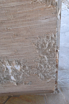
cat scratching damage

And this:
cat and dog damage

And this:
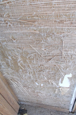
damage from humans opening 
the coat closet every day

We got some estimates to have all the drywall replaced, but they all came in over $5000.   So, I scraped. And an hour later, it looked like this:
This is one hour of labor using Dif.

And another hour later with the same product:

At this rate, it was going to take a week just to strip the kitchen!  And the drywall was being damaged....

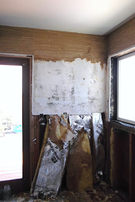
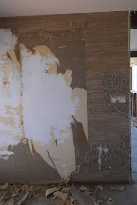
So, I tried Wip Chomp.  In about twenty minutes, our entryway went from this:

To this:

This wall went much faster, and with less damage to the drywall, but really, I've had more fun at the dentist's office.  There is still a lot of wallpaper left.  So much wallpaper left.  So very much.


Keeping my eyes on the prize....  enjoy what's left of your weekend!


This post is being linked to the following lovely places:
Under the Table and Dreaming

Thursday, April 28, 2011

Stripping at the Beach This Weekend!


Uhhhmmmm, that would be wallpaper stripping.
 
Can you see all the grasscloth wallpaper in this place?  It is in all of the public spaces of the beach house.  And it needs to come down.  It is badly damaged and fraying from cats' and dogs' claws. 


It is also thirty years old, so all of the thread fibers woven through the grass have rotted, which makes it just a mess to strip! 


I have the entryway about half-way stripped, and the dining area about a quarter of the way done.  Now it's time to finish it up.  It is truly a dreadful job, and it makes me sneeze!


At least I will have this great view, to remind me how truly blessed I am.


Monday, April 25, 2011

Sleeping Lofts and Beach House Dreaming

In the last post about our beach house remodel, I shared a picture of our second guest bedroom, as well as an adjacent attic space.  A few of you successfully guessed our plans for the space.  We want to add a loft to that bedroom, so that it will sleep more people.  Of course, if you count raising the house as "phase one" of our remodel, and remodeling the garage wing and kitchen as "phase two", adding this loft falls somewhere around "phase 37" in the scheme of things -- but it's fun to dream, and plan, and prepare....

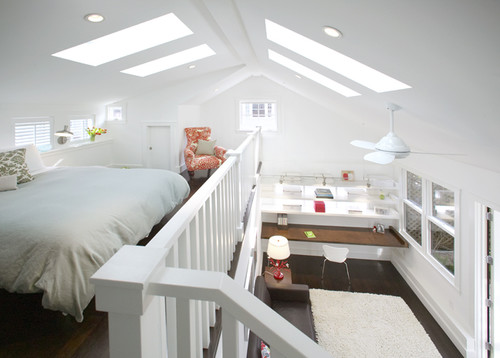
Here are a few sleeping loft images we've collected for inspiration.   I love this first image of a boathouse sleeping loft.


This loft has several bunks, and plenty of headroom.

The nautical detailing on this 2004 Southern Accents Watersound Beach Showhouse is striking.  the design is by Suzanne Kasler.


This darling little sleeping loft in an outbuilding in the Catskills is pure fantasy.
 

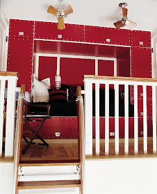
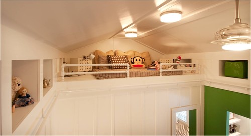
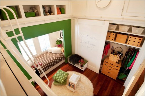
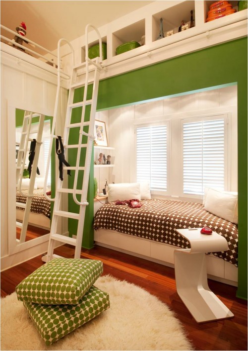
How about this fun design for a kid's room?  I like the pipe rails.
Growing Up Stylish contemporary kids

Growing Up Stylish tropical bedroom
Growing Up Stylish contemporary kids

This space is very modern, but still feels warm and inviting.
Feldman Architecture modern bedroom

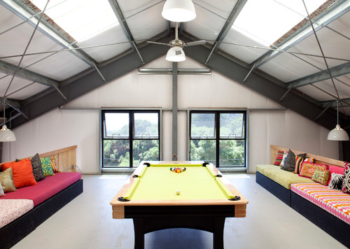
Okay, this loft space is quite a bit larger than ours, but I just loved the cheery colors juxtaposed against the steel framework of the space.
CCS ARCHITECTURE modern family room

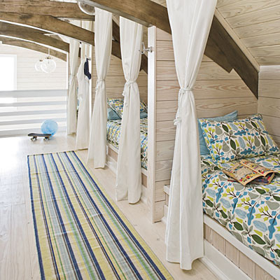
The partitions and curtains in this sleeping loft give a sense of privacy.
Bunk Room eclectic kids

For a reminder, here is the bedroom we want to add a loft to....

... and here is part of the adjacent attic space we want to convert to a loft space, accessed from the bedroom.
How to do it?

We can open up the wall between the two spaces.  This is a load bearing wall, so we will need to transfer that load to the wall and I-beam below.  This can be done by using headers and columns, or possibly by just using columns, if they are placed under each of the existing roof beams. We'll have our structural engineer weigh in on this, for peace of mind.

Can you see it?

Here is a quick little diagram showing the space configuration.


Now, can you see it?


Photobucket
Good Life Wednesdays
Chic on a Shoestring Decorating

Sunday, April 24, 2011

Hiding the Ugly Chandelier

When we were decorating for my daughter's baby shower, she asked us to "please hide that fugly chandelier!"  So, we decided to cover it in masses of flowers.  Huge tissue paper flowers. 


We didn't completely cover the chandelier, but maybe we were able to distract the eye a little bit?


At any rate, it was fun and festive.


Here's how we made them.


We used doubled layers of tissue paper to give the flowers a little more body, and to introduce a second color.


These flowers were very inexpensive to make, and definitely added a girly feel to the baby shower!

The DIY Show Off
Tip Junkie handmade projects

Monday, April 18, 2011

Beach House Guest Room Update

We shared this concept for our guest room remodel several weeks ago, and thought it might be time for a quick update.

This room (and the whole house, for that matter) has undergone some altitude changes lately!


This is what the room looked like when we first saw it.  It was dirty and moldy, and full of construction (or should I say "destruction") debris.


This is how it looked after some serious cleaning.  The drywall wall has been removed from the lower half of the walls to prepare for the next step of the remodel -- lifting the house nine feet to recapture the ocean view.


Here, the house has been raised three feet.  This wing of the house was a converted garage, so the walls were detached from the slab and lifted straight up.  That's the sliding door to the guest room, with the steel beam running through it.


Next, the house was raised six more feet!  If you look up in this picture, you will see the guest bedroom way up there -- with no floor...


Now, the space has a floor!   All the electric has been roughed in, so as soon as it's inspected, we will close up the walls.  A new sliding door is on its way, to replace this one, and the contractors will be starting the guest room deck in just a few days. 

Here is a reminder of how the exterior of the guest room has progressed.


When we found this oceanfront house, it looked like this.  It is literally only two hundred feet down a path through the dune grass to the beach, and the crashing surf!


But it had lost its view, due to a growing sand dune.  We decided to buy the house and have it lifted.  In the photo above, the house has been raised about three feet.  Those sliding doors are the doors you saw above in the guest room interior pictures.


Now it's up nine feet!  


 And here is a quick overview of the before and after concept.

You can see more on this guest room remodel, here.  To read more about the beach house renovation, go here.


And, I can't wait to share our plans for the other guest space!  This room is right next to the other guest room in the garage wing of the house.  Our short term goal for the room is for it to be clean and dry and habitable.  The longer term goal involves the space shown below.


This space is directly over the first guest room (the one with the sliding doors).  The wall on the left in this picture is the top several feet of the wall on the right in the picture of the second guest room.

Can you guess our plan?


This post is being linked to the following lovely places:


Tickled Pink at 504 Main