Monday, January 31, 2011

Thrift Store Frame Makeovers and an Art Show

My camera is broken!  So, for the next few days, I'll be finishing up some posts I started writing and never finished -- which would be easy, if I hadn't just accidentally deleted a whole bunch of pictures of tutorials and "before and afters" from my hard drive.   Do you ever have days like that? 

Back in December I was invited to join a local art show!  It was tons of fun, and I got to meet lots of people from my community.  At the end of the show, I was even approached about putting stuff in a local gallery! 


I don't actually have access to any original work right now (it's all in storage till the remodel is finished), so the pieces  used were copies-of-prints-of-scans-of-originals from my portfolio. 

Of course, all these copies of prints of scans would need to be displayed nicely -- people wouldn't appreciate a table strewn with copy paper  -- and why buy new, when there is a thrift store nearby, right?  So, I hit the Goodwill and found this lovely green frame with a print of some lavender.


Since my pieces were small, this little 5 x 7 frame and these little easels were perfect.


Here is an example of where thrift stores are not always cheaper -- these easels were a dollar each, which is what the local IKEA sells them for!


This little canvas frame has a tiny picture area -- only about 3" x 3", which was perfect for a tiny piece I wanted to display.  And remember how I said I've lost a whole bunch of pictures from my hard drive?  The "before" from the third picture frame was among the lost.


To transform the frames, first the brads on the back were pried up, and the canvas boards were removed and set aside.  Then each of the frames got a coat or two of black paint, and some touches of gold.


Next, I sorted through my portfolio and found some pieces I liked, to take to the copy center.


Those new copies-of-prints-of-scans of marker drawings were then applied to the canvas boards that had been removed from the frames earlier.


I used matte Mod Podge.  Which I love.  They each got a couple of coats, using the brush strokes to add texture in a believable way.  Truly, good old Mod Podge took the pieces from being sad little photocopies to looking like real art! 


The little pictures got lots of attention at the show.


Nobody seemed to notice or care that they were lowly photocopies. I got a lot of questions about the "texturizing medium", and the other artists were surprised it was Mod Podge.  Really?


The backs of the pictures got lots of attention, too.  Just for fun, I used pages from a drawing instruction book, along with a copy of a pen sketch to give the backs a nice finished look.


The backs of the pictures were a big hit!


The book pages were from a thrifted copy of Drawing from the Right Side of the Brain -- it seemed appropriate.


All in all, the show was really fun -- there was some amazing art there, by REAL artists, who sell their paintings for thousands of dollars a piece.  It was humbling...


... but,  it was such an honor to show my little copies-of-prints-of-scans-of-marker-drawings along side so much talent.

I was really happy with the "made over" frames, though, and the way the Mod Podge rocked the photocopies!

To learn a little more about how the original pieces were created, you can read this article about marker rendering, or this page about concept communication.


this post is being linked to these lovely blogs:

Today's Creative Blog
handmade projects

Saturday, January 29, 2011

Interior Design Secrets -- What Designers Really Read

Well, folks, this isn't glamorous, but so many of you are interested in interior design that I thought I would share a few more design secrets.   These are some of  the REAL SECRETS of interior design, that you can use as you design and tackle your own DIY projects.

Here is a list of books that is an essential part of an interior designer's arsenal. It is not an exhaustive list, but these are volumes that are referenced over and over again.  Most of these books can be found at your local public library, so you don't have to lay out a lot of cash to have access to great reference material when you're making your plans.


See that giant catalog binder on the corner of this bed?  Designers schlep dozens of those things around just to find furnishings and accessories, but that's just a tiny part of what an interior designer does.  Designers definitely read tons of catalogs -- those catalogs change with the wind -- and they're not secret.  The real secret arsenal rarely (or never) changes (although the contents of some of these books are periodically updated to represent latest codes and research).  Some secret weapons are listed below:

  • Human Dimension and Interior Space is full of charts and illustrations like the ones on the cover.  Although most designers will automatically know commonly used dimensions, this book lists thousands of anthropometric dimensions that are easily referenced when planning a space.   And because nothing is ever simple, you have to know that most of the data used in this book was collected a couple of generations ago -- and we're taller now.  Maybe.  It is really important, however, to understand how the body uses a space.  We don't want to create an environment that leads to repetitive stress injuries, or worse.  We want to create functional spaces that are safe and enhance quality of life.

Human Dimension and Interior Space: A Source book of Design Reference Standards 

Panero and Zelnick

  • For anyone interested in furniture design and space planning, Time-Saver Standards is an indispenable reference manual.  And you know that repetitive stress injury I mentioned earlier?  Well, let's just say this book is about four inches thick, and after schlepping it around all day you may need to see your chiropractor -- or your orthopedic surgeon.

Time-Saver Standards for Interior Design and Space Planning
Joseph DeChiara, Panero, and Zelnik


  • In The Hidden Dimension, Edward T. Hall examines spacial boundaries from a social and cultural perspective.  An eye opening book, it will effect how you look at and plan spaces.

The Hidden Dimension  by Edward T. Hall


  • No reference list would be complete without the codes books, and they are real page turners -- not!  They are a necessary evil, however.  You could never possibly memorize all the building codes that are relevant to your practice or project (and you don't want to, as they change too frequently), but you need to A) have an idea about when there may be a codes issue, and B) be able to lay your hands on the building code adopted by the jurisdiction where your work is being performed.  That's not always enough, however, as most jurisdictions add their own revisions to their adopted code. 

International Building Code
  • Also, the building codes are subject to the interpretation of local inspectors -- and their opinions vary broadly.  So, we also really lean on our contractors to know what will and will not fly, as they usually know how the local inspectors interpret codes.  Confusing?  Yep.


International Residential Code


  • A kitchen and bath designer may have at least a few volumes from the NKBA Professional Resource Library.


  • If you can't get your hands on the Professional Resource Library, you can probably at least find this handy little book at your library, or find it online for around twelve bucks.


So, there they are.  A few indispensable interior design books.  Designers will have references for textiles and other finishes that they refer to, as well.  This is not an exhaustive list.

And yes, designers love to look at pretty coffee table books!  We keep those out where our clients can look through them for inspiration, but we draw inspiration from them, too.  We all have our favorites -- I'm currently digging anything beachy or artsy modern.

These are some of the REAL secrets of interior design, I hope you are not too disappointed by the unglamorousness (I just made that word up) of the profession?  Tell me what you think.  What books would you add to the list?


this post is being linked to the following lovely places: 
504 Main
all crafts Handmade Projects ~ Add Yours! handmade projects

Thursday, January 27, 2011

A Few More Seashell and Sea Inspired Chandeliers

This is the second of a series of sea inspired decor posts.  The first post also focused on chandeliers and pendants and can be found here.  There are just so many great and unique shell inspired fixtures out there, they didn't all fit into one post!

Below is a typical capiz shell chandelier, but with a twist.  If you love capiz shells, but don't want the same thing everyone else has, this fixture, available through Horchow, may be the right choice for you.  I like the gently curved drum shade.


Another capiz shell fixture is this globe, made from gazillions of gorgeous capiz flowers!  It is modern, playful, and feminine.


This coral inspired chandelier is actually made from hammered metal.


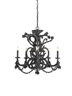
I thought I would throw out a couple of teasers.  These two black chandies were available a couple of years ago through J. Covington Designs.  I think they were from Curry and Company, but I haven't been able to find them available for purchase online recently.


This little oyster shell pendant will be available through J. Covington this spring.
This Serena Bowl Pendant, by Oly Studio, is pretty unique.  I'm not usually a fan of bowls, as they tend to collect bugs (just keeping it real...), but this actually has little spaces between the disks, so if a bug gets zapped it will fall right through!  (Okay, maybe not what you want to think about when you're sitting down to your roast beast -- maybe I need to work on keeping things less real...)
available through Candelabra Lighting and Home Decor

So, once again, I ask you:  How do you feel about shell chandeliers?  Are the gaudy?  Are they gorgeous?  Are they a little bit of both?  Be sure to check out this post to see lots more sea chandies.

Would you install one in your home?  In your vacation home?


Monday, January 24, 2011

Beachy Guest Bedroom Before, Now, and After Concept

Most of the demolition on our beach house renovation has been finished, and we have a bit of a lull in work until the house is raised to a higher elevation in a couple of weeks. (The raising, itself, was delayed by a couple of months, but that's a story for another year...).   So, it seemed like a good time to share some of the concepts we are working on for the different spaces, and some "before and during" pictures.

 On the left is a concept of how the finished guest room could look, 
and the picture on the right shows how it actually looks right now.  
The image on the left was created in GIMP (a free program, very 
similar to Adobe PhotoShop), using images of actual products.

One of the bedrooms on the east wing of the beach house, has been on my mind.  It started out as a garage when the house was built, then later DIYers converted the space to a bedroom.  At the same time, an adjoining workshop was converted to a "master suite".  This DIY remodel might have added value to the house, but for two reasons -- poor design, and shoddy workmanship.

This picture was taken standing in the garage conversion, looking into the 
"master suite" that was converted from a workshop.  See the utility sink 
on the left and the breaker panels on the far wall?  Yikes!  This master 
suite will ultimately be converted into a large bedroom with a loft, and a small den.

The space planning of the conversion was truly appalling.  You had to walk through a child's room to get to the master suite -- which still contained it's original utility sink,  I might add!

Here are some pictures and concepts we have been working on for the first bedroom:

Before~ the space was full of debris, old appliances, lumber, you name it.  The lavender walls were full of holes, wiring was stapled to the wall and painted over -- or just sticking out, uncapped.  Mold was growing on the wall above the door, and under the vinyl wallpaper.  The threshold of the vinyl door was cracked, and the ceiling was scarred from where an oddly placed closet had been removed.


Now~ the debris, lumber, and old appliances have been removed, and the lower drywall has been removed to prepare the space to be raised.  I still need to remove the rest of the wallpaper, and attack the mold (again).  After the house is raised, new drywall and firetape will be intalled, and the ceiling will be patched.  A new closet will go in just to the right of where the dog is standing in this picture (your right, not the dog's).


After~ Seriously, I will be happy when the space is a clean, dry, mold-free, rat poo free, exposed wire free box, but the ultimate goal is to create a warm, comfortable and welcoming space for our guests.

Built-in cabinets flanking new french doors create a focal point for the space, board and batten paneling reinforce the "beachy" feel, while drawing the eye toward the focal point.  Additionally, because this room is very long and not very wide, adding the built-ins will help to correct the room proportions.  The bed I've shown is from PB, but ultimately, I have an inherited mahogany four-poster that would be used (just didn't have a photo of the piece to use in this image).


This image was created from the "during" photo, above, using GIMP.  
A products list can be found at the bottom of this post.

In case you were wondering what the space looks like from the outside, here is a before and after concept  of the exterior.   This side of the house has a view of the bay, which is very charming, and it is a bit protected from the strong ocean breezes we can get on the other side of the house, so it will be a lovely place for guests to come in the morning with their coffee.

The image on the right was created using Google SketchUp.  

What do you think?  I love being able to conceptualize how a finished space will look -- after a little paint, sweat, and tears.

Do you like the direction we are taking with this renovation?  Are you interested in seeing space plans or the before and after?  Let me know in a comment, and be sure to click on "follow" in my side bar, so you don't miss out on the rest of the renovation as it progresses!

You can read more about this beach house project here.

Have a wonderful week! 


product credits:  painting "Fishing Boats On Beach", Driftwood Mirror from All Driftwood Furniture, basket from Adirondack Pack Baskets, Cordova Glazed Lamp in Chartreuse from Clayton Gray Home,  Dresser from Restoration Hardware, Bed and Bedding from Pottery Barn, drapery panels and built-ins Peter's Gotcha Covered, ottoman from Bombarock.


This post is being linked to these lovely blogs:
Thrifty Decor Chick Before and After Party
Tools are for Women Too
Tatertots and Jello Weekend Wrap Up Party
Saturday Nite Special at Funky Junk Interiors
Friday Fun finds at Kojo Designs
Feature Yourself Friday at Fingerprints on the Fridge
Time Traveler Thursday at Brambleberry Cottage
Favorite Things Friday at A Few of My Favorite Things
Fab Friday at Frugal and Fabulous Designs
Remodelaholic's Anonymous
Crazy Cute at Between U and Me
Under $100 at Beyond the Picket Fence
Southern in My Heart Inspiration Friday
It's a Hodgepodge Friday
Feathered Nest Friday at French Country Cottage
Tales from Bloggeritaville at Thrifty Thursday
DIY Project Parade at The DIY Show Off
Show Off Your Stuff at Fireflies and Jellybeans
Strut Your Stuff at Somewhat Simple
Shabby Chic Cottage Transformation Thursday
Hookin' Up With HoH
Thrilling Thursday at Paisley Passions
Catch a Glimpse at a Glimpse Inside
Upcycled Awesome at the T-Shirt Diaries
The Trendy Treehouse
All Thingz Related Anything Related Party
Power of Paint Party at Domestically Speaking
Whatever Goes Wednesday at Someday Crafts


Boogieboard Cottage

Tuesday, January 18, 2011

Happy Home Al Fresco, the Beach House, and the Kitchen Renovation

For all my dear friends who left comments and emails in the last couple of days -- I am not ignoring you.  I just fell a little behind when I had to make a quick trip out to the coast to meet up with some contractors about the beach house renovation.  Honest.  It was a business trip.  Really, it was.

It was still a bit foggy out to sea, but it cleared up in time for my 
camera battery to die a few minutes after this picture was taken :)
 Does anyone else have luck like that?

And even on, ahem, a business trip a girl's gotta eat breakfast.  It's the most important meal of the day.

 Look!  It says "Happy Home".  Can you think of a better 
way to start the day in our new old beach house?

Of course, when the kitchen looks like this...


 ... you have to pack your milk in a sweet vintage thermos, and pick up some locally baked pastries.  And then you have to step out onto the deck for some fresh air and a view of the white caps.  You have to.


We've made some progress.  Did you notice the stack of doors is gone?  Well, not gone actually.  Just leaning against a different wall.  They had to be moved to remove the old moldy drywall from the refrigerator nook.   Apparently the ice maker had leaked for years....


.... and the sink had leaked, so all the lower drywall on this side of the room has been removed, as well.  Something else is missing, too.  Do you know what it is?  It's the rat poo! I'm doing the "no more rat poo happy dance"!

Sigh.  I love my kitchen.  I'm pretty sure people think I'm crazy 
when I say that, but they don't see the things I see. (At this point my 
husband would probably interject that they don't hear 
the voices I hear, either, but that's a subject for a different post...)

No more mold in my kitchen, and no more rat poo, either -- woohoo!  In a few weeks, there won't be any rot in there, either.  I'm just keeping my eyes on the prize.


Remember what we started with?  We really are making some progress.  The holidays and the weather and the crazy short daylight hours slowed us down a lot, but we're ramping up again.


This was what the kitchen looked like at first.  See that very dirty looking floor area where the cabinets used to be?  Yup.  That's rat poo.  Lots and lots of rat poo....  I walked into that kitchen the first time, right past the rat poo, and knew I was home, but I think my husband wanted to run the other way!

I do hope there will be lots more meals taken like 
this -- even after the kitchen renovation is finished.

Now, just for fun, here's a picture from down at the beach this morning.

Look at that handsome dog -- can you believe he'll be fifteen 
in June?  I had to keep calling him up the cliff to keep him 
away from rolling logs today.  He just has so much energy!

This picture is very deceiving.  That little log in the background actually has a diameter of over four feet at the base.  When the waves came crashing in, they would pick that log up like it was a bath toy and roll it around, and twist it in different directions.  This is why it is so important to stay far away from logs in the surf.  A wave can pick it up and put it on top of you in a heart beat!    And waves can really take you by surprise -- just a couple of minutes after this picture was taken a wave crashed right where I was standing to get this shot.  Aslan (the dog) and I bolted up the cliff, barely escaping a good soaking!

Now, I'm off to start returning emails -- I missed you guys!


This post is being linked to these wonderful blogs:

giveaways
504 Main